DESIGN + ART DIRECTION

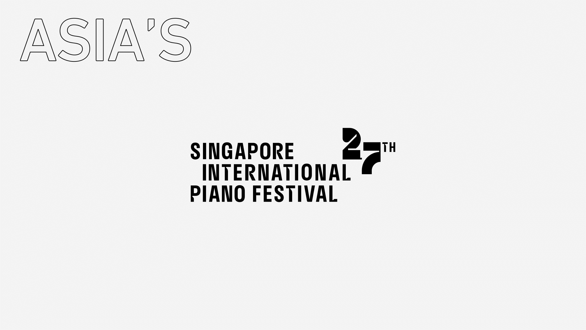

SG INT’L PIANO FEST 27
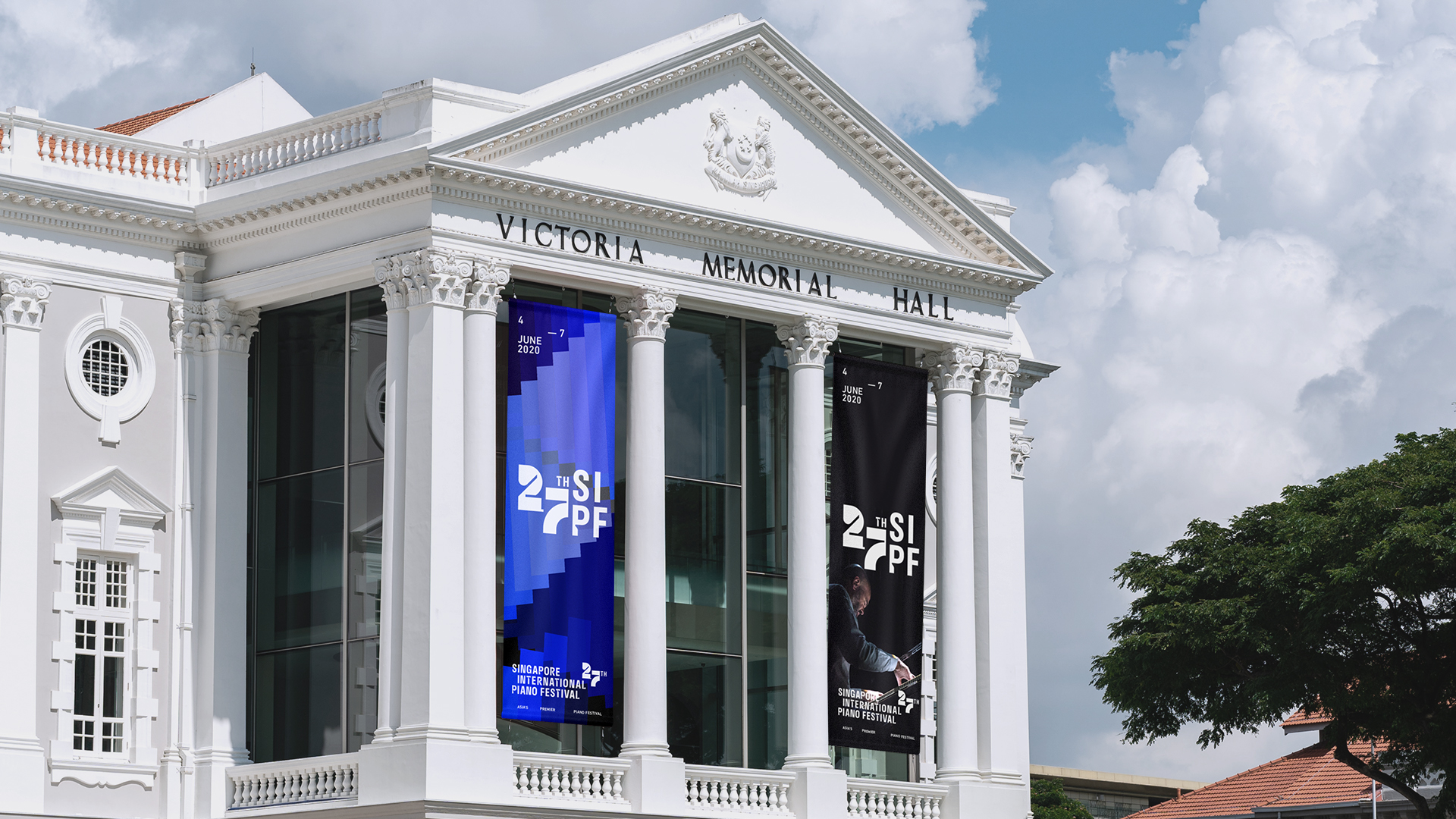
The Singapore International Piano Festival is a unique classical music festival organised by the Singapore Symphony Group. Every year since 1994, it hosts some of the world’s most prominent piano maestros on back-to-back evenings at the Victoria Concert Hall for fans to witness the brilliant solo recitals performed by master artistes.
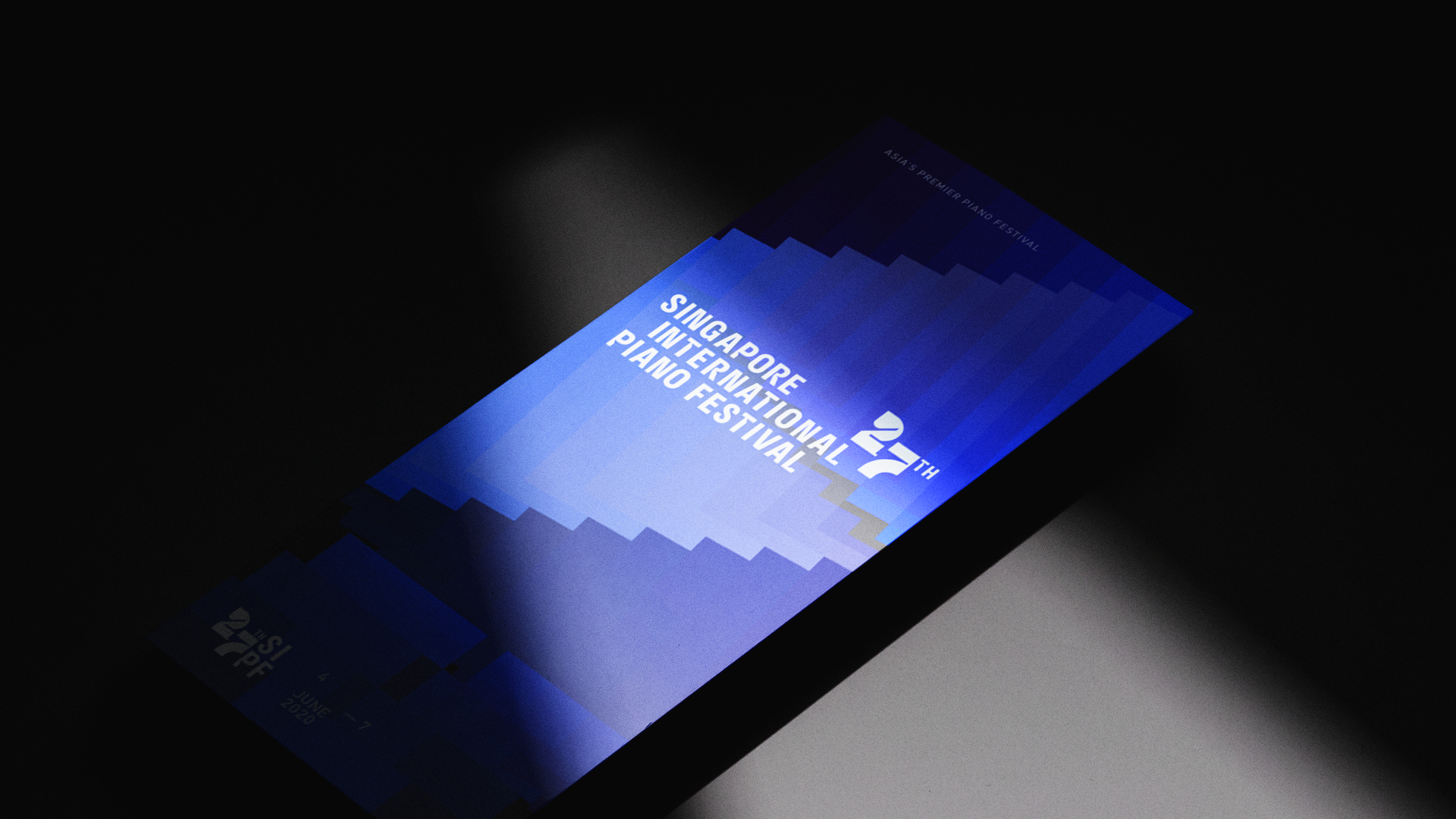
With the successful festival becoming a regular annual highlight for classical music lovers, I was engaged by SSG to design a new logo that will reflect its rising eminence.
With the successful festival becoming a regular annual highlight for classical music lovers, I was engaged by SSG to design a new logo that will reflect its rising eminence.
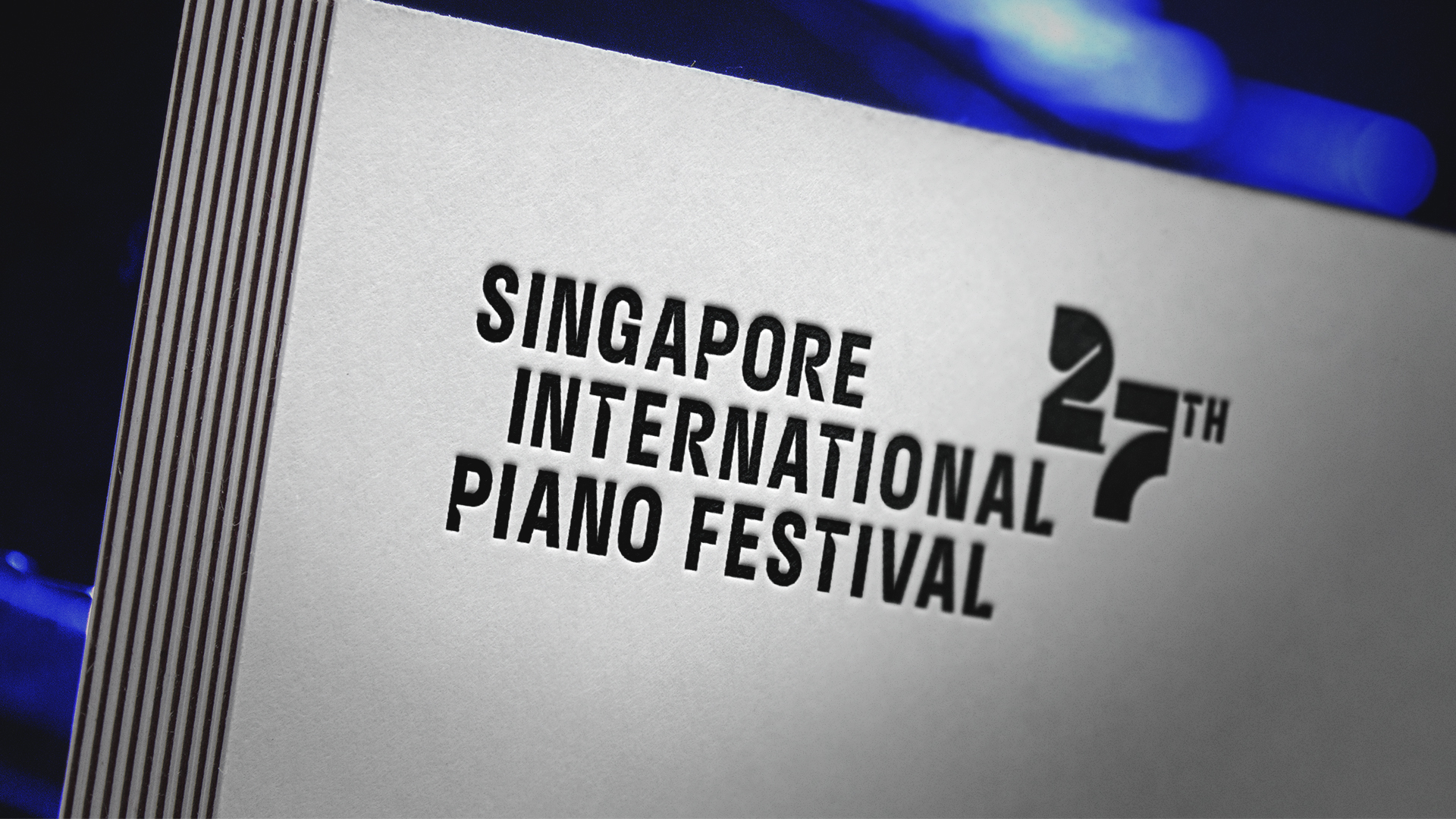
I crafted the logo to embody the essence of the festival — the grand piano. This includes giving some of the letters a little nip that references the rounded ridges on the ivory keys, and forming the edition numbers with wide, clean lines that reflect the grand piano’s imposing silhouette and sleek surfaces.
The condensed typeface, which aids the legibility of the long title, complements the contrasting bold font of the numbers. Finally, the words are stacked in a slightly offset arrangement that points at the dynamism within the artists’ performances.
The condensed typeface, which aids the legibility of the long title, complements the contrasting bold font of the numbers. Finally, the words are stacked in a slightly offset arrangement that points at the dynamism within the artists’ performances.
GALLERY
CLICK ON IMAGES TO ZOOM IN ︎
(SCOPE)
LOGO DESIGN
CUSTOM TYPEFACE
LOGO DESIGN
CUSTOM TYPEFACE
(CLIENT)
SINGAPORE SYMPHONY GROUP
SINGAPORE SYMPHONY GROUP
(YEAR)
2019
2019

OTHER LOGOTYPES