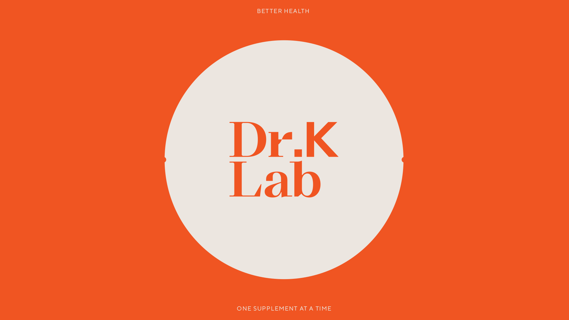


DR.K LAB
Dr.K Lab is a new brand that provides young Burmese adults with more access to high-quality vitamins and health supplements. Founded by experienced retailer and medical expert Dr. Khin, Dr.K Lab prides itself on sourcing its formulas from the most trusted and established manufacturers in America.
Dr. Khin approached Paradox in 2021 to develop the brand’s visual identity and packaging design. We came up with the brand’s name and crafted a visual language that reflects its vision as a modern label for young, health-conscious Millenials.
Dr. Khin approached Paradox in 2021 to develop the brand’s visual identity and packaging design. We came up with the brand’s name and crafted a visual language that reflects its vision as a modern label for young, health-conscious Millenials.
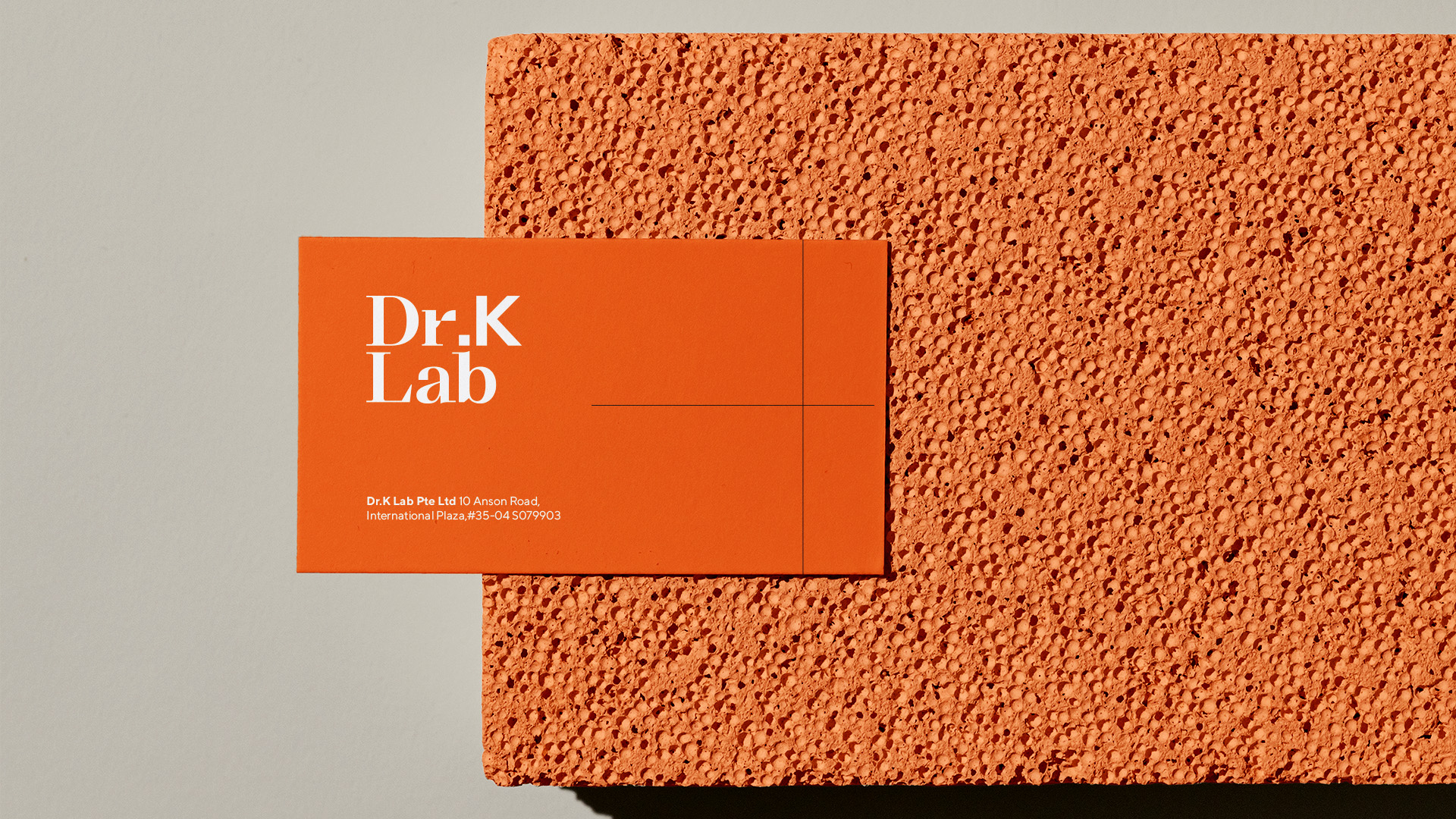
A wordmark was designed for the Dr.K Lab logo, which features a line graph reaching its peak as the terminal of the ‘r’, symbolising the brand’s mission to help people stay in the peak of their health.
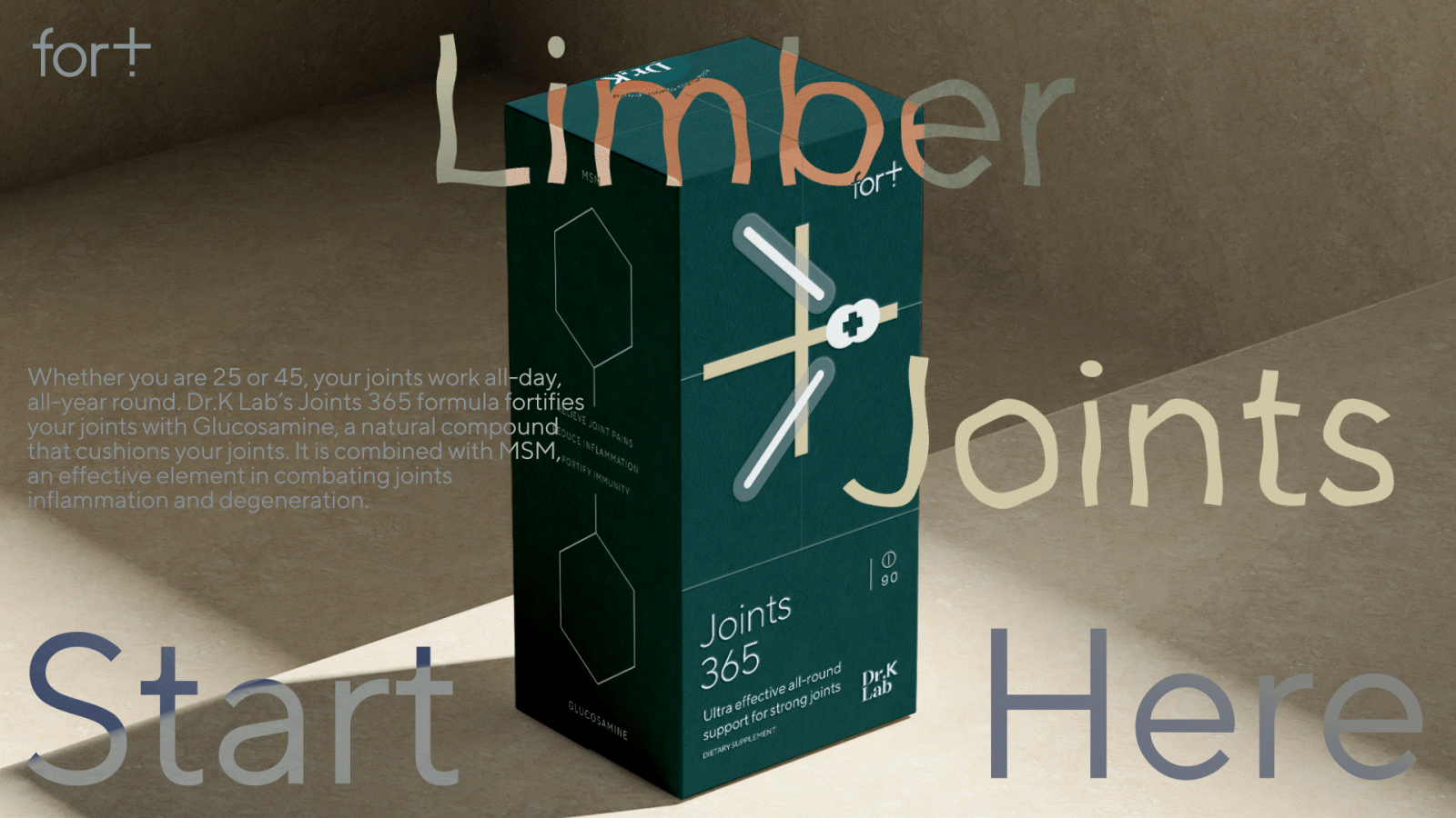
The brand and packaging graphics style itself on graphs, charts and symbols, which bring to mind the workings of a medical science practitioner. Vibrant colours and clean, engaging typography elevates the lively energy around the visual identity to create an aesthetic that is dynamic and stimulating.
The brand and packaging graphics style itself on graphs, charts and symbols, which bring to mind the workings of a medical science practitioner. Vibrant colours and clean, engaging typography elevates the lively energy around the visual identity to create an aesthetic that is dynamic and stimulating.
DONE AT PARADOX SG
GALLERY
CLICK ON IMAGES TO ZOOM IN ︎
(SCOPE)
LOGO DESIGN
BRAND IDENTITY
PACKAGING DESIGN
LOGO DESIGN
BRAND IDENTITY
PACKAGING DESIGN
(CLIENT)
DR.KHIN
DR.KHIN
(YEAR)
2021
2021

OTHER IDENTITIES