


ST SIGNATURE
ST Signature is the first boutique co-living hotel in Singapore, embracing a redefined concept of travel comfort for the modern nomad.
Using intelligent space design, travellers can enjoy luxurious private rooms and shared amenities, such as a fully-furnished kitchen, without the extravagant cost of a classic hotel. Smart tech replaces the traditional concierge to fully automate the check-in and check-out process, and collaborations provide guests with wide variety of activities to explore.
Using intelligent space design, travellers can enjoy luxurious private rooms and shared amenities, such as a fully-furnished kitchen, without the extravagant cost of a classic hotel. Smart tech replaces the traditional concierge to fully automate the check-in and check-out process, and collaborations provide guests with wide variety of activities to explore.
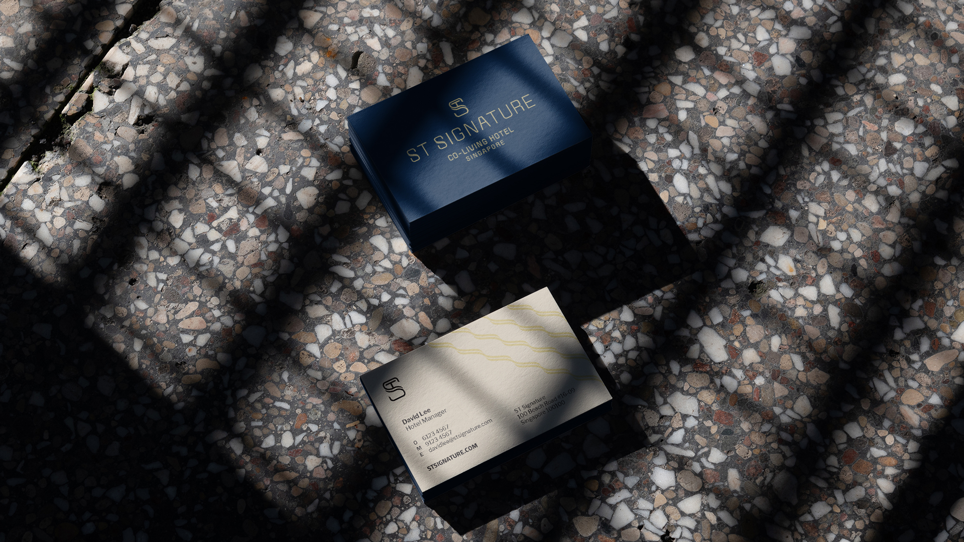
Paradox was engaged by ST Hospitality to design the logo and visual identity for the new brand.
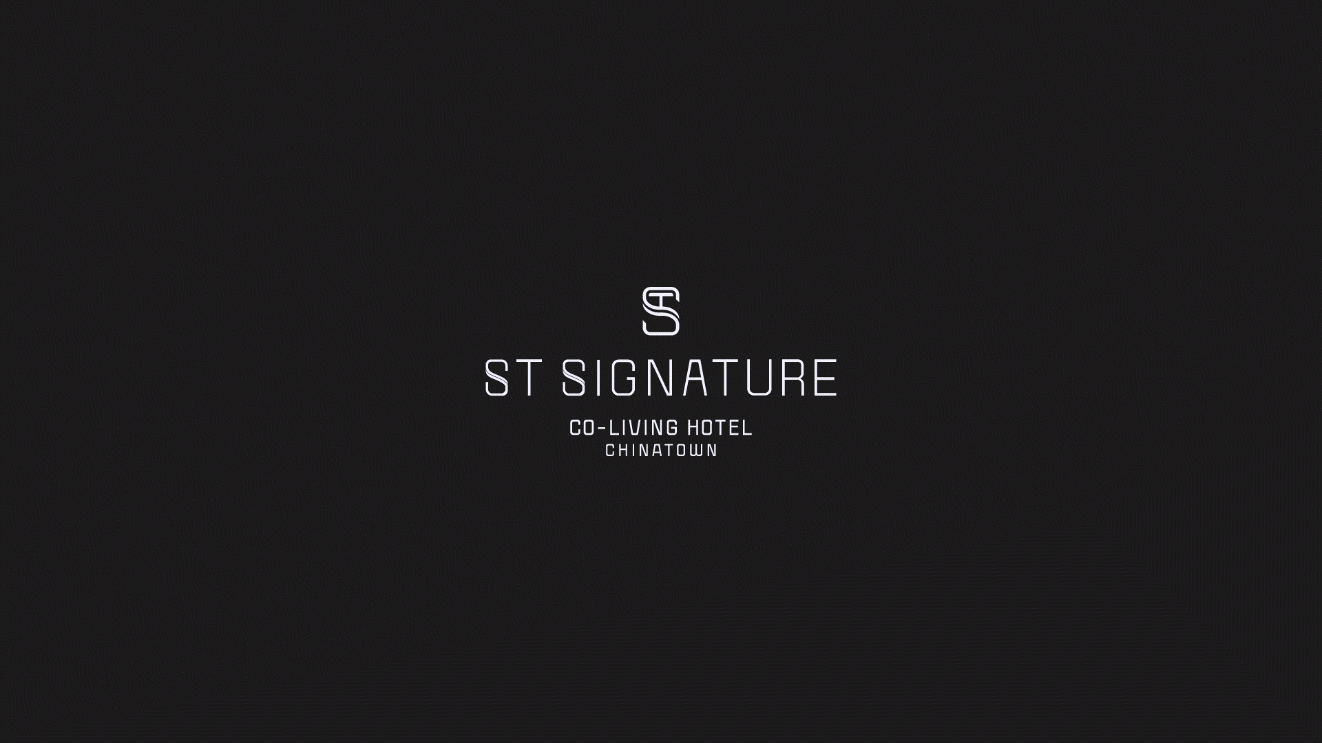
The ST logomark depicts the cross-section of the signature space-saving design of ST Signature’s rooms. It is also a top-down view of the ‘T’ laying in bed, symbolising comfort and rest.
The thin and angular typeface of the wordmark alludes to the brand’s modern, urban concept. Calm, urbane colours reflect the comfortable, luxurious quality of its rooms and facilities.
DONE AT PARADOX SG
GALLERY
CLICK ON IMAGES TO ZOOM IN ︎
(SCOPE)
LOGO DESIGN
BRAND IDENTITY
LOGO DESIGN
BRAND IDENTITY
(CLIENT)
ST HOSPITALITY
ST HOSPITALITY
(YEAR)
2019
2019

OTHER IDENTITIES